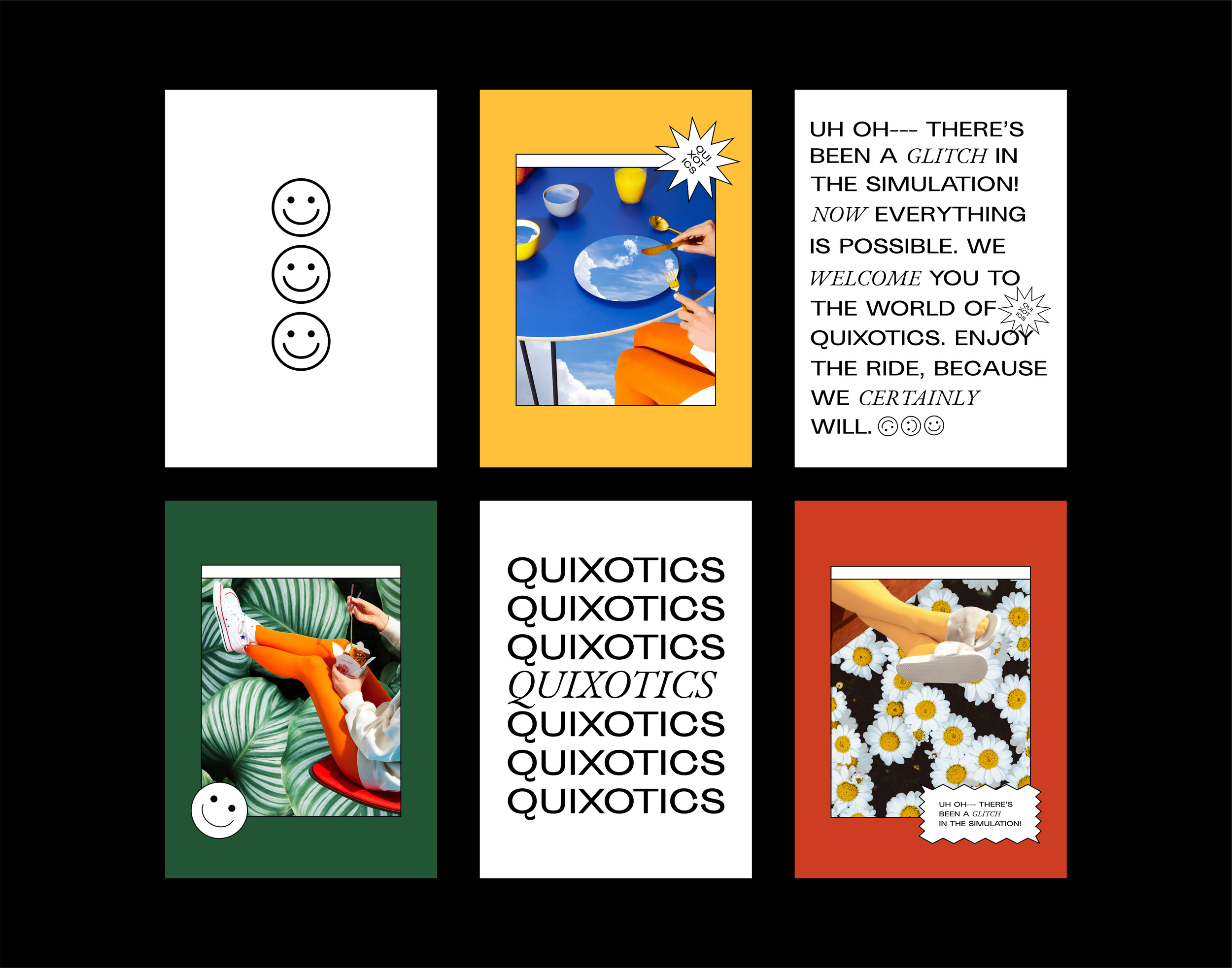
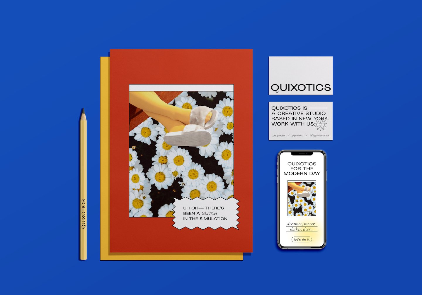
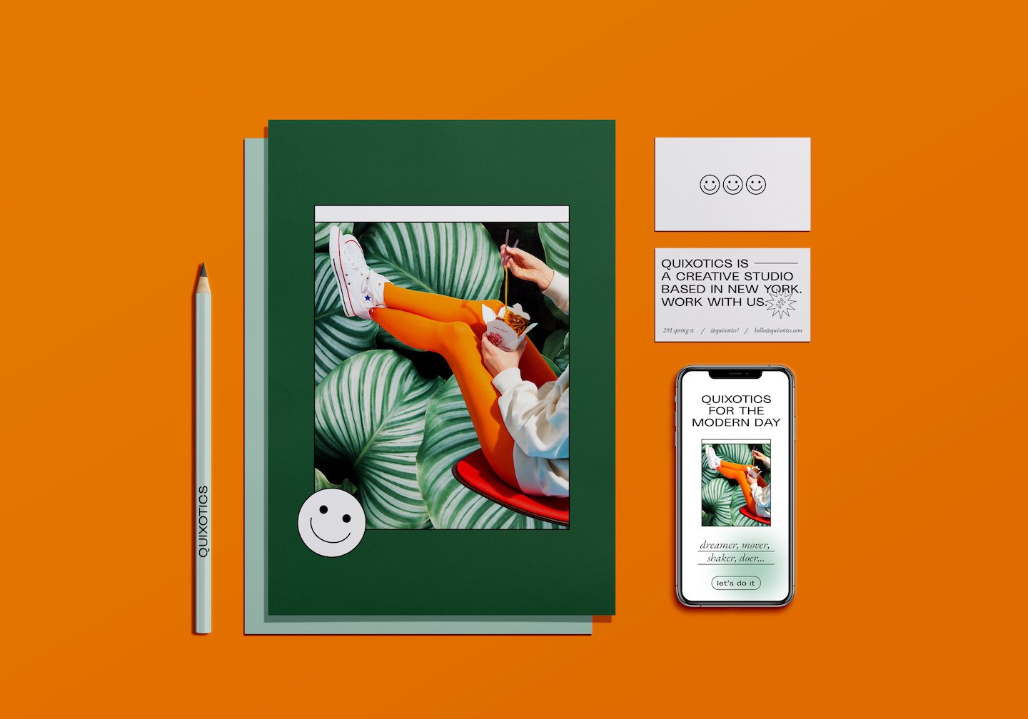
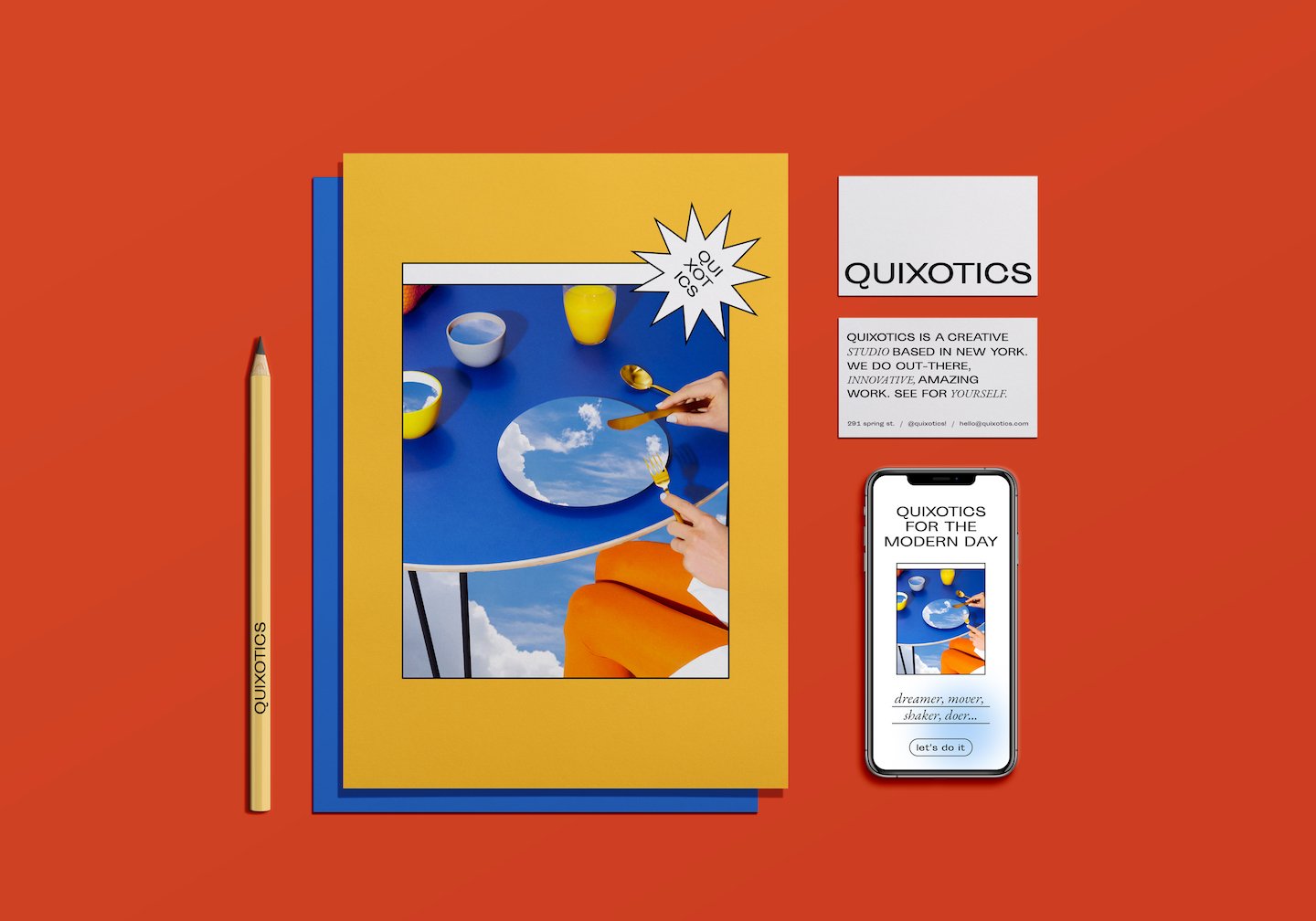
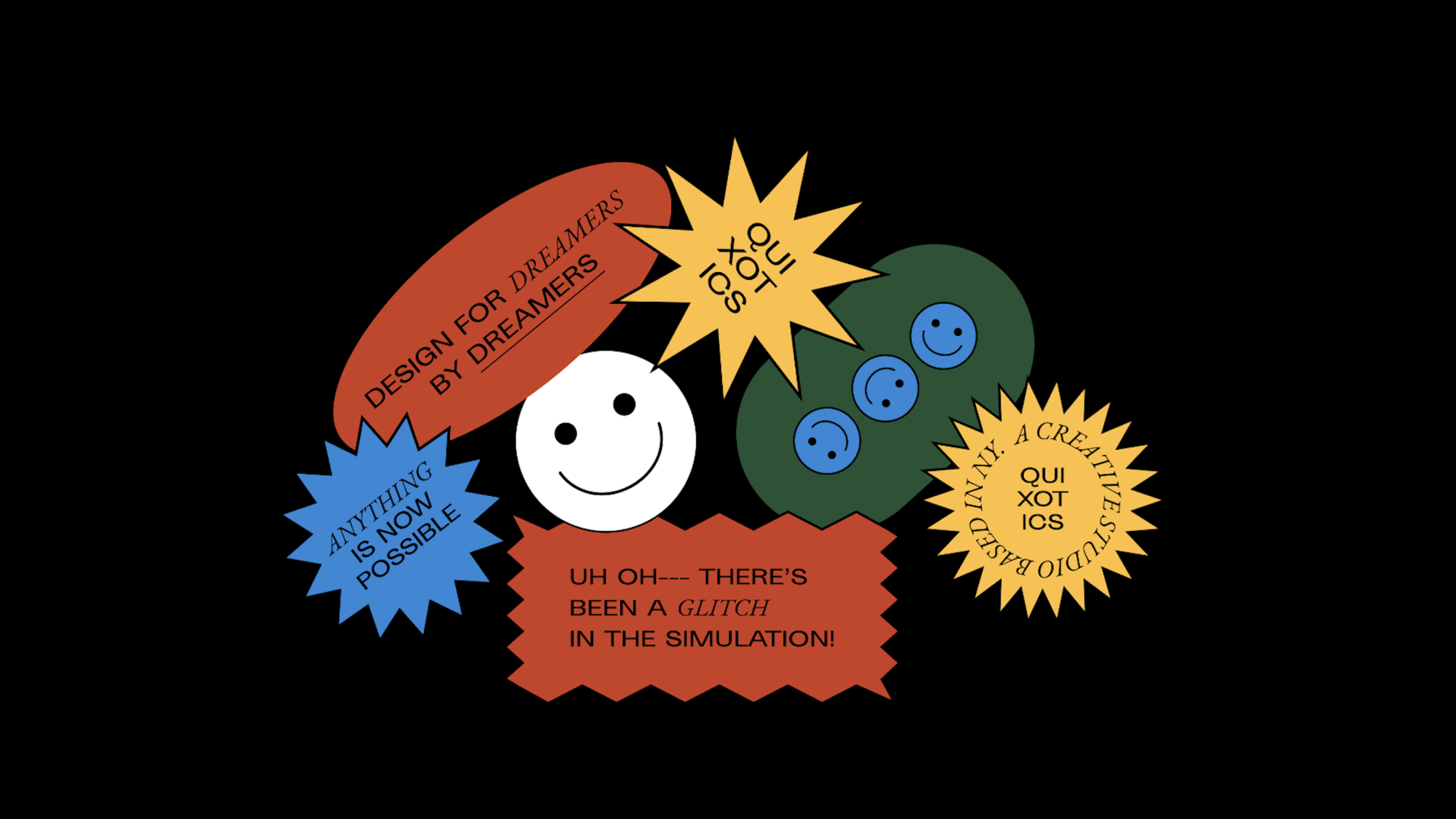
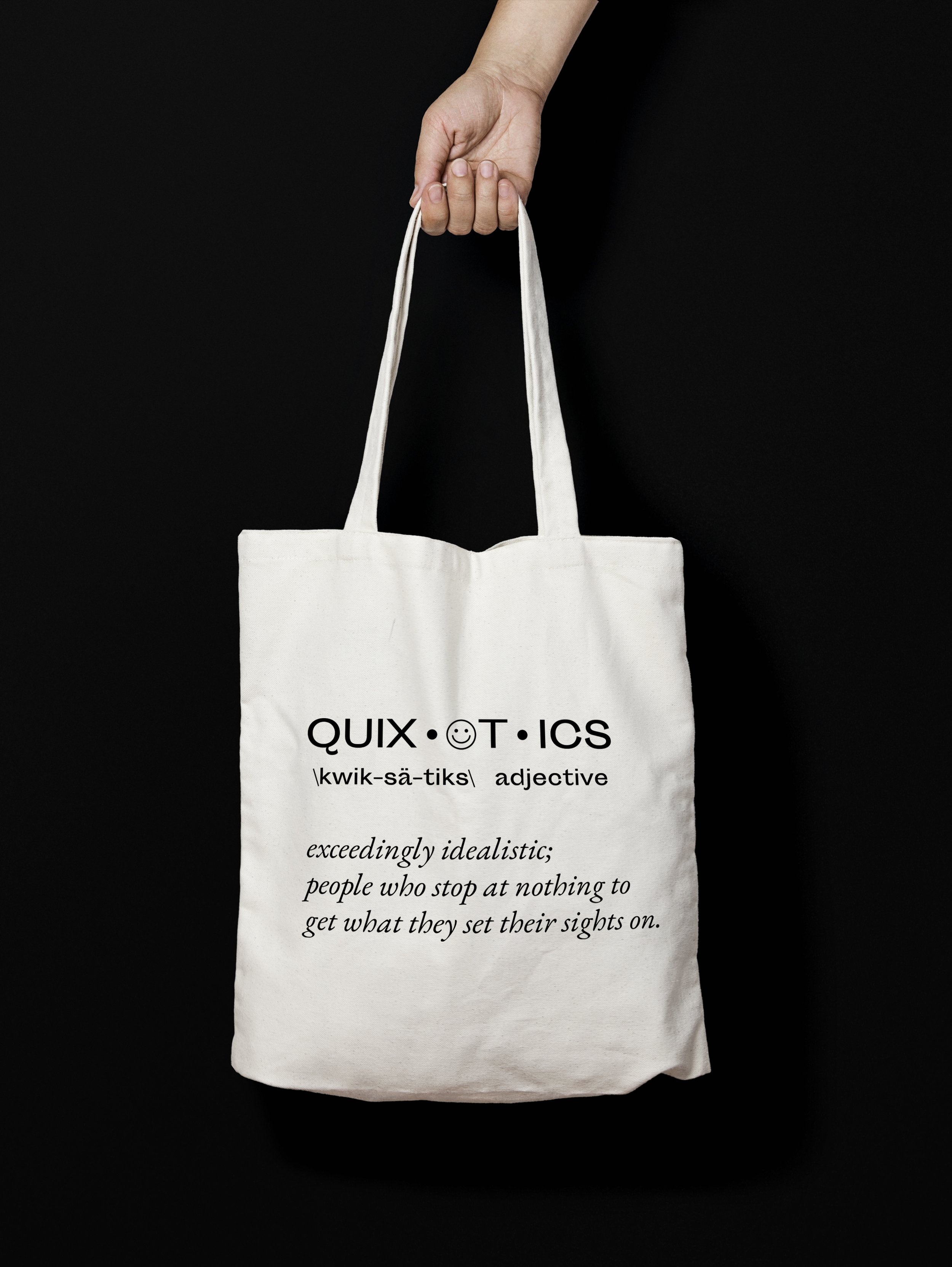
Exceedingly Idealistic.
Quixotics (Spring 2020) was born out of my love for the word "Quixotic," which means "exceedingly idealistic; unrealistic and impractical." I wanted to brand a design studio that celebrated the unrealistic and strived to create impossibly good work. As a fun added challenge to keep me in line with the idealistic/impractical mindset, I gave myself one 3-day weekend to complete the concept from ideation to execution.
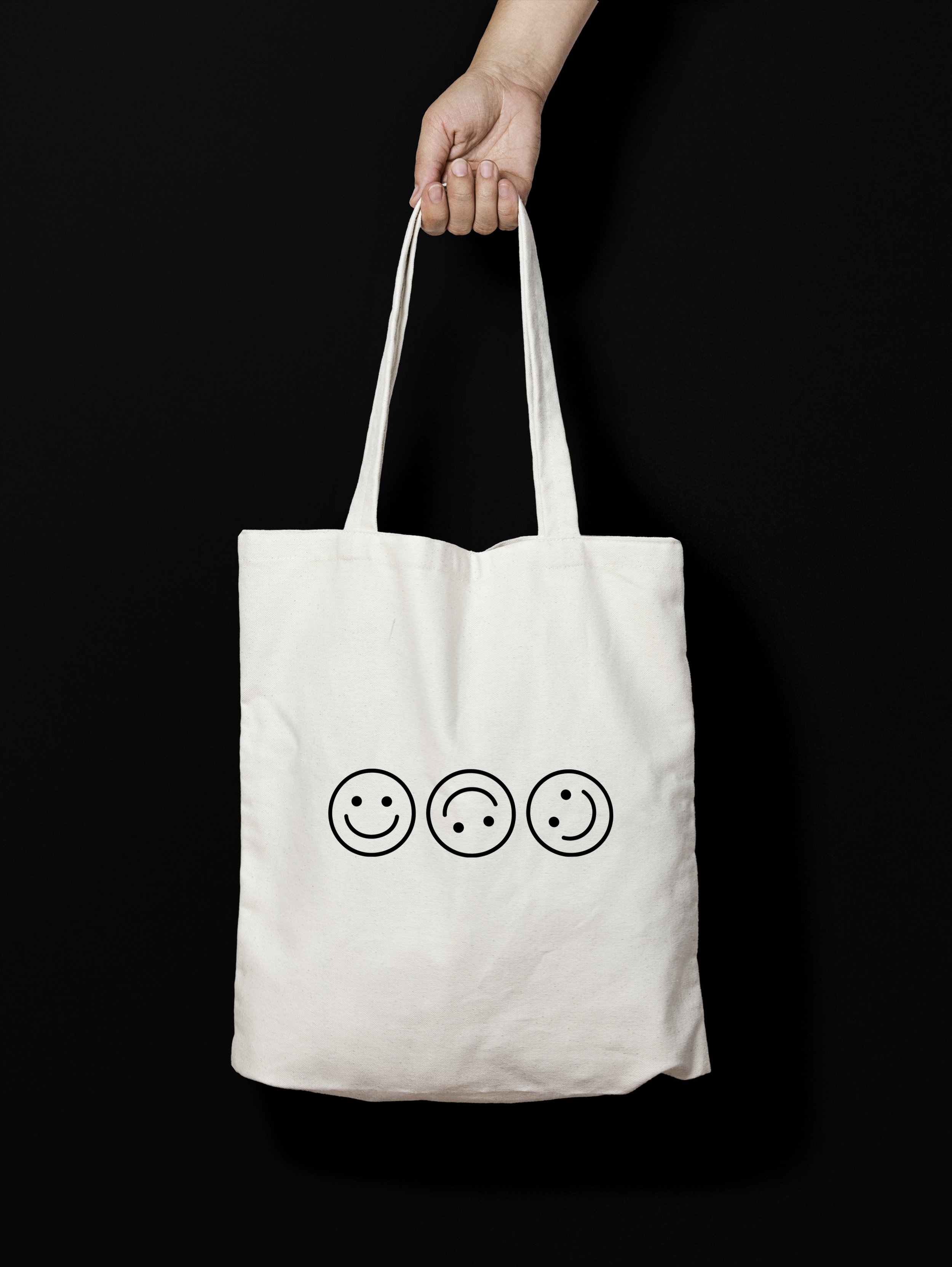
Brand identity
Packaging
Creative Direction
Campaign
Website
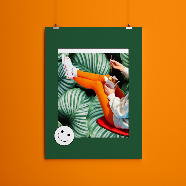
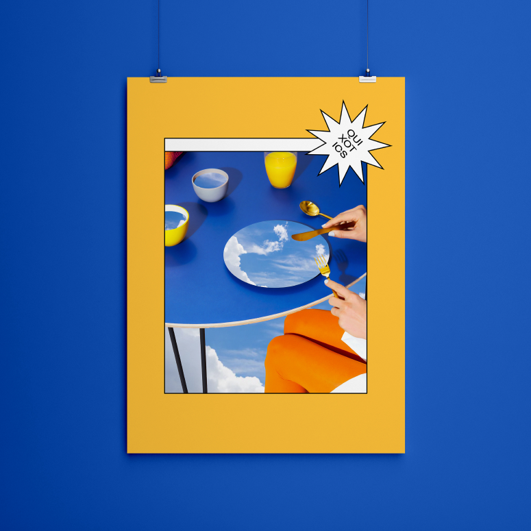
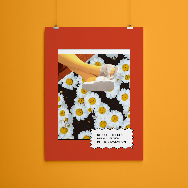
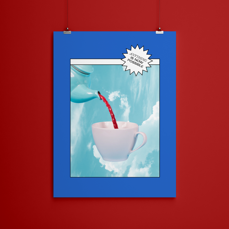
In order to achieve this unrealistic (and dare I say wacky) vibe, I collaged and edited everyday photos on top of whimsical backgrounds. I then contrasted this imagery with brutalist-style text in black and white.


Photographs from Unsplash, edited by me.
Fonts used: Sporting Grotesque (by Lucas Le Bihan, George Triantafyllakos, & Maciej Polczynski from Velvetyne Type Foundry) and EB Garamond Italic.